
Ever felt your website drag on your phone while it’s zipping along on desktop? You’re not alone.
Let’s chat about responsive AI websites. An AI site uses machine learning (an algorithm that learns from data) to:
- tweak layouts on the fly
- preload images and videos before you even see them
- serve content suited to any screen
Nice.
That means faster page loads, smoother scrolling, and a brand that looks sharp from your pocket to your desktop.
Ready to nail flawless engagement? We’ve picked 10 top tools that power these AI-driven sites, so you’ll keep visitors tapping, scrolling, and coming back for more.
Exploring responsive AI websites: key capabilities and user benefits
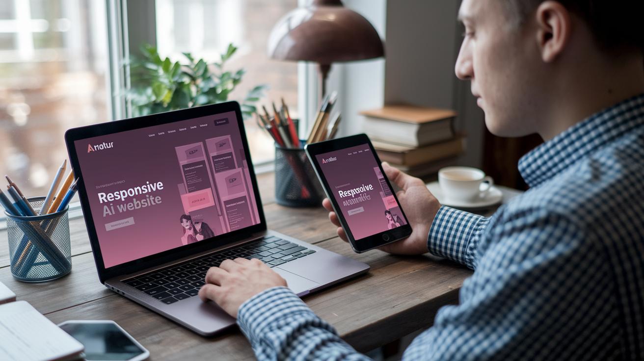
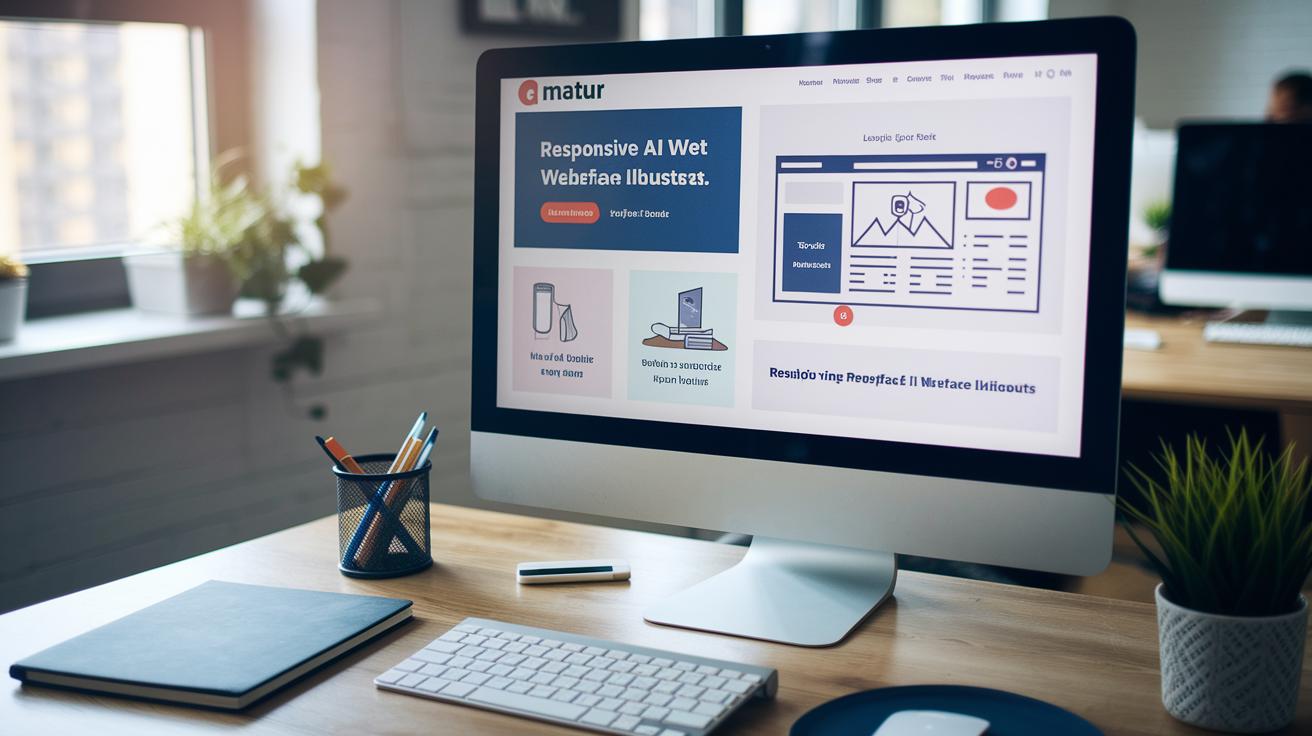
A responsive AI website uses machine learning (an algorithm that learns from data) to adapt layouts, content, and load times in real time on any device – desktop, tablet, or smartphone. This mobile-first approach means your site is built to look great on phones before anything else. You get one codebase that flexes to every screen size, while the AI works behind the scenes.
Here are the main AI-powered features that make this possible:
- Real-time UI scaling so buttons, images, and text resize smoothly on all screens
- Predictive resource loading based on user behavior analysis (tracking clicks and scrolls) to preload assets before visitors need them
- Personalized content placement that highlights what matters most to each person, using their past interactions
Companies see results fast when they go responsive with AI. We’ve cut manual coding work by up to 40%, so you launch sooner. You’ll also deliver a consistent user experience and brand look across devices, and free your team to focus on writing great copy instead of tweaking CSS rules.
Next, we’ll compare the top AI design platforms that power these features.
Top AI-driven platforms for responsive AI website design
Building a responsive website with AI (artificial intelligence) can take just minutes, not days. These tools handle your layouts, images, and personalization so you can focus on telling your brand story and boosting conversions.
- Adobe Sensei uses machine learning (a type of AI that learns patterns) to crop images and match colors. It also suggests layouts.
- The Grid tweaks your layout on the fly based on your content and goals. It even suggests font combos and grid shifts so your site stays sharp on any phone or tablet.
- Wix ADI builds a full site design after you answer a few questions. Then you can tweak each version for desktop, tablet, and phone. It’s a dream for creators who need a fast, flexible setup.
- Firedrop feels like chatting with a design buddy. Its chatbot asks questions. It makes layout tweaks in real time and learns your style so its suggestions feel personal.
- Zecoda turns your static mockups into tidy, responsive code. It adds grid and stack layouts for each screen size. Then it gives you style guides so devs can pick up where you left off.
- Google AutoML Vision (an AI tool that analyzes images) tags your pics and delivers the right size for each device. It spots blurry files and suggests better ones so your pages load sharp and quick.
- Optimizely slices your audience by behavior and runs AI-driven personalization tests. With multivariate tests, you find the layouts that click and launch them without a hitch.
- Bookmark AI lets you drag, drop, and watch the AI suggest content blocks. It even updates sections based on what’s trending. You’ll go from zero to a mobile-ready site in minutes.
Picking the right tool comes down to your process and team size. For a detailed tool comparison, check our guide on ai tools for web design.
Then, when you’re set to build, we’ll walk you through every step in our tutorial on create a website with ai and get your first responsive, AI-powered site live.
Best practices for fluid layouts and adaptive breakpoints in responsive AI websites

Designing for every screen doesn’t have to be a headache. With fluid layout generation AI (artificial intelligence that builds flexible grids automatically), you get container rules that stretch or shrink on the fly. And this tool even writes CSS media queries (rules that adjust styles by device width), so you skip endless manual tweaks.
Follow these simple steps:
- Use flexible grid units (like fr or percent) so columns shift smoothly as the screen grows or shrinks.
- Automate CSS media-query creation so your design rules apply across all devices without manual edits.
- Let AI pick adaptive breakpoints (screen widths that trigger layout changes) based on your content and top devices.
- Scale images with vector formats (images that stay sharp at any size) or srcset attributes (lists of image versions for different screens).
- Use dynamic typography (responsive text sizing) so font size, line height, and spacing adjust to each viewport for easy reading.
Predictive resource loading AI (AI that preloads assets before you need them) takes care of hero images (the big banner image) and key scripts for you. This cuts wait times and keeps visitors engaged. Then test on real devices so you see exactly how images, text blocks, and buttons flow from desktop to phone.
Step-by-step guide to implementing responsive AI websites

Choosing Sections & Kicking Off AI Layout
To begin, open your site in the editor. Click on the section you want to adapt. You’ll see an AI icon – a little design helper – appear in the toolbar. Just hit it and select “Generate Now.”
In seconds, the tool uses machine learning (an algorithm that learns patterns) to suggest a layout that flexes across every screen size.
You can apply this new structure to all breakpoints (screen-size views) – desktop, tablet, and mobile. Or zero in on mobile first. Starting with mobile ensures your phone view shines before you scale up to larger screens.
Here’s a quick checklist:
- Click the section you want to update.
- Tap the AI icon and pick “Generate Now.”
- Choose all breakpoints or just mobile.
- Wait as AI builds grids or stacks for real-time responsiveness.
Reviewing & Fine-Tuning the AI Design
When AI serves up a design suggestion, you have two choices: hit “Use Design” to lock it in, or “Discard” to go back. If you accept, every breakpoint gets a fresh grid or stack to keep things aligned.
Then you can tweak colors, margins, and font sizes on each view – no coding needed. It’s your design.
As you refine, keep an eye on:
- Edits on a higher breakpoint (like desktop) cascade down to smaller ones unless AI overrides are in place.
- Rerunning AI on mobile replaces any manual tweaks you made there.
- The Undo button works across all breakpoints, so you can back out of any AI update.
- To drop AI overrides on a lower breakpoint, clear that element’s override flag, and your desktop edits will flow back to phone and tablet.
By following these steps, you get a head start from AI plus full control over the final look. You’ll end up with a responsive AI website that feels tailor-made – even though AI handled the heavy lifting.
Monitoring performance with AI-driven real-time UI scaling

On responsive AI sites, tracking speed and layout shifts can feel like chasing ghosts, you know. But with real-time UI scaling AI, we catch hiccups before they hit your metrics.
It watches First Contentful Paint (FCP), when content first shows up. It also tracks Cumulative Layout Shift (CLS), which measures unexpected layout jumps, and image load time. Then AI tweaks how resources load, locks container sizes, and resizes images on the fly so everything stays crisp. Nice.
Here’s a quick look at how it works:
| Metric | AI Feature | Impact |
|---|---|---|
| First Contentful Paint (FCP) | Predictive resource loading | Reduces load time by up to 30% |
| Cumulative Layout Shift (CLS) | Layout shift prevention AI | Improves stability score by 25% |
| Image Load Time | AI-driven compression and resizing | Decreases asset size by 40% |
You can stream these metrics straight to any analytics dashboard that supports real-time UI scaling AI. Set alerts if FCP climbs above your target or if CLS spikes past a safe range. When a red flag shows up, rerun the AI on that section and watch your numbers bounce back in minutes.
From day one, set clear performance goals. As traffic grows, these AI insights help you tweak your grid layouts, breakpoints, and asset priorities. The result? A site that stays fast and reliable on every screen, all year long.
Pair these metrics with heatmaps and session recordings so you see exactly where users stall. Then performance tuning hits the real needs.
Case studies and future trends in responsive AI websites
Ever landed on Netflix and thought, “Hey, this feels like me”? That’s responsive AI (artificial intelligence that tweaks a site layout in real time). Netflix rearranges banners and picks suggestions based on your watch history and device size.
Views shot up over 20% once they flipped the switch.
Amazon does something similar. It watches how you click and scroll, then reshapes the product grid. Tablets get bigger cards, phones get tighter lists.
Conversion rates climbed 15% after they set it up. Nice.

⚡ GET THE AI EDGE
Weekly AI tips that actually save you time and money. No fluff, no hype — just what works.
And Spotify? Their Discover Weekly playlist is a masterclass in personal touch. Under the hood, an algorithm (a step-by-step computer recipe) adjusts fonts and layout for each listener. Every scroll feels custom-made.
Got it.
Looking ahead, three trends are about to shake things up:
- Voice-activated interfaces will let you reorder sections or open menus just by speaking.
- Augmented reality (AR, a tech layer that adds digital images to real life) overlays products on your tablet or tests makeup on your phone camera.
- Predictive personalization (an AI feature that guesses what you’ll need next) pops up a checkout button when you linger or suggests live chat if you get stuck.
But hey, we can’t just trust robots entirely. We train these models on diverse data sets and run bias checks early. We also build in GDPR-compliant prompts and automatic alt-text audits to keep everything fair and private.
Human oversight matters. It’s our checkpoint to make sure responsive AI sites stay powerful and honest.
Ensuring accessibility and compliance in responsive AI websites

Ever felt stuck trying to make your site accessible and compliant? With responsive AI websites, you get accessibility optimization AI (an algorithm that spots and fixes access barriers) built right in.
It constantly scans your pages for missing keyboard focus states, broken tab order, or browser quirks. And when it sees a problem, it applies a fix on the fly so keyboard navigation and cross-browser compatibility stay solid.
We automatically tag interactive elements – like buttons and menus – using Accessible Rich Internet Applications (ARIA) roles (labels that tell screen readers how to announce each item). We also generate alt text (descriptions for images) so screen reader users don’t hit blank spots. Nice.
Next, to meet privacy rules, these tools serve GDPR-ready privacy prompts (General Data Protection Regulation – EU privacy law) that change wording based on where your visitor is. On the back end, AI-managed metadata optimization (adding secure headers and updating privacy tags) keeps your site up to date. You’ll even get automated compliance reports – no more manual audits.
By weaving these AI features into your design workflow, you’ll build sites that serve every visitor and stay on the right side of data regulations. You’re covered.
Final Words
We dove right into how responsive AI websites use machine learning to adapt layouts, content, and performance in real time. You discovered top AI platforms like Adobe Sensei and Wix ADI, plus best practices for fluid grids and adaptive breakpoints.
Then we walked through a hands-on setup, real-time UI scaling metrics, and real-world wins from Netflix, Amazon, and Spotify. You also saw how AI tools handle accessibility and privacy compliance.
With these insights in hand, you’re ready to build faster, smarter responsive AI websites that grow with your audience.
FAQ
Frequently Asked Questions
How do I make my website responsive with AI?
Making your website responsive with AI involves using machine-learning tools to auto-adjust layouts, scale UI elements, and optimize content placement across desktop, tablet, and mobile in real time.
What does responsive AI do?
Responsive AI automatically adapts a site’s layout, content, and resources in real time to deliver a consistent user experience and branding across all device sizes.
What are examples of responsive AI websites?
Examples include Adobe Sensei–powered portfolios, Wix ADI–built business sites, The Grid’s content-driven layouts, and Bookmark AI–generated templates that adjust fluidly across screens.
Are there free responsive AI website builders?
Yes, free options include Wix ADI’s free plan, Bookmark’s basic tier, Firedrop trial, and Google’s open-source AutoML Vision to test AI-driven designs at no cost.
What are the best responsive AI website builders?
Top builders are Adobe Sensei for predictive layouts, Wix ADI for guided templates, The Grid for real-time adjustments, Firedrop’s chatbot design, and Bookmark AI’s drag-and-drop editor.
How does responsive AI differ from generative AI?
Responsive AI focuses on layout adaptation and UI scaling, while generative AI creates original text, images, or code. Responsive AI optimizes site display; generative AI builds new content assets.
What is Dora AI?
Dora AI is an AI web assistant that generates responsive layouts, automates content placement, and predicts resource loading to streamline web design workflows in real time.
What is the best AI website to use?
The best AI website depends on your goal: ChatGPT excels at answering questions, while Wix ADI, Adobe Sensei, and The Grid lead for responsive website design with real-time layout automation.
📥 FREE: THE AI PLAYBOOK
The exact tools and workflows I use to run a one-person agency. 25 years of marketing experience distilled into an actionable guide. Yours free.